Snooze Product Design
Timeline
August - September 2022
Focus
Product, Experience and Interface Design
Design Team
Caroline Bosch - Solo Designer
Snooze is a concept for a mobile app that helps users improve their quality of sleep through meditation, routine setting, and sleep tracking.
This project was primarily completed during my time in General Assembly’s UXDI bootcamp. I spent three total weeks researching, designing, prototyping, and testing the app.
Two of those weeks were an initial design sprint, during which I identified a core user need, and designed and tested a mid-fidelity prototype. Later, I returned to the project, and spent one week re-assessing the app’s usability and bringing it to a higher visual fidelity.

User Research and Product Discovery
The sleepy classmate
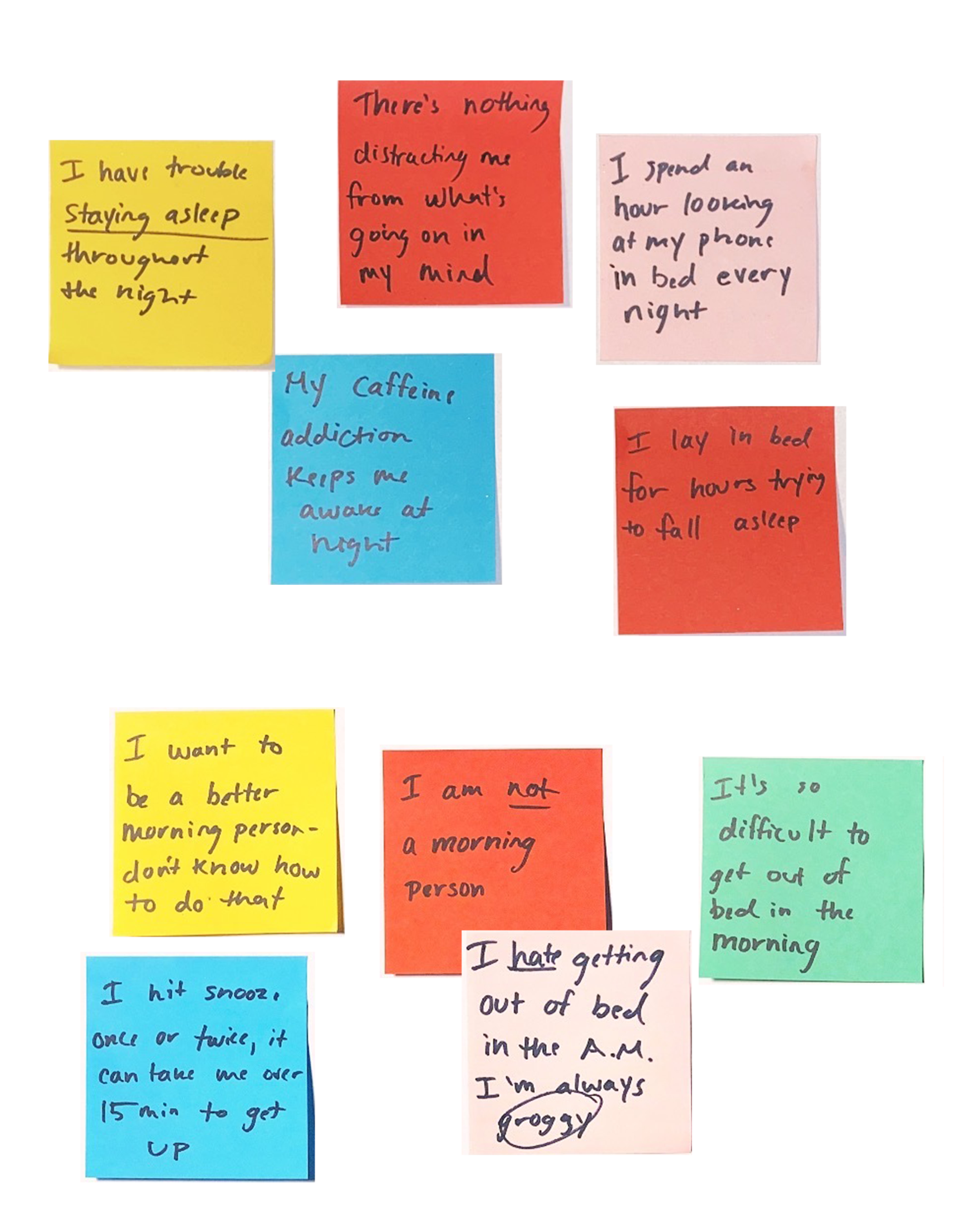
This project was introduced as an opportunity to solve a problem for a classmate. After an initial conversation, I realized that this person had one fundamental problem that seemed to be affecting all the other little things in their life: poor sleep quality.
“Sometimes I lay in bed for two hours before I can fall asleep. I’m tired throughout the day, and I rely on caffeine to stay energized.”
The many sleepy humans
I found my classmate’s problems surrounding sleep to be relatable, and I knew the issue was broad - poor sleep quality could stem from many different sources.
I had so many questions: how do people currently manage their sleep schedules? what do their morning and evening routines look like? how do they wake up? what affect does mental health have on sleep quality?
To answer some of these questions, I conducted five user interviews - and, after synthesizing my findings through affinity mapping, I started to see some trends.
Defining Solutions
People want morning routines and consistent sleep schedules
User research helped me identify and categorize key pain points surrounding sleep. I spent some time considering possible solutions, and analyzed competitors in the wellness space to get an idea of (1) what’s already working well for users, and (2) how to differentiate Snooze from other apps solving similar problems.
I came up with three main opportunities to drive the design process forward based on insights gained during research.
Insight One
MORNING ROUTINES, PLS
Users want their mornings to be more structured and productive.
How might we help them start habitual morning routines that increase motivation and productivity every day?
Insight Two
HELP ME FALL ASLEEP
Users have trouble falling asleep.
How might we relieve stress and rumination through meditation to improve the experience of falling asleep?
Insight Three
I NEED ALL 8 HOURS
Users want to maintain consistent weekly sleep schedules.
How might we leverage sleep tracking to help users recognize patterns in their habits and identify potential correlations between lifestyle factors and quality of sleep?
Design
Starting the day with intention, creating healthy habits, and visualizing change over time.
After sketching some ideas, I moved into Figma to solidify an initial flow and bring my prototype to mid-fidelity.
I decided to incorporate all three opportunities outlined above into three features: routine setting, meditation, and sleep tracking.

Routine setting
Users can customize their daily routines, giving structure to their goals and creating positive habits over time.

Meditation
Integrating meditations, soundscapes, and sleep music provides users with tools to start and end their days with intention.
Sleep tracking
Utilizing both quantitative metrics and qualitative data from a quick daily survey allows users to see long term sleep trends.

Usability Testing
“I really like how it’s laid out. It would be calming to wake up to, and it’s clear what my options are. The only part I was slightly confused about was the hierarchy of items on the home page.”
I conducted four remote, moderated usability tests with users who fit my target demographic (remote workers who self-identified as having trouble with sleep). I received quantitative feedback in the form of the System Usability Scale, and followed up with a series of questions for qualitative feedback.
Testing Results
85.6 avg. SUS score
75% avg. task completion rate
4/4 users felt that the clean user interface made the experience simple and straightforward
2/4 users were distracted by extraneous information (specifically the blog posts at the bottom of each page). I saw an opportunity to refine the prioritization and hierarchy of information on individual screens.
Tab bar icons were unclear to 3/4 users and needed to be labelled and refined.
Designing and Iterating
A more intuitive (and joyful) interface
Based on initial feedback, I made changes to the information architecture, global navigation, and content hierarchy on individual pages. Most notably, I removed the original “home” page, which was essentially another form of global navigation that didn’t guide users into tasks naturally. Instead, I made the “plan” page (below) the starting point, and integrated the other features (meditation and sleep tracking) into that page for a more intuitive and interconnected flow.
I also refined the UI and developed a unique visual identity with custom illustrations to bring the app to life.

A customizable routine to build long term habits
Since routine setting has such a heavy impact on long term behavior change, I changed the flow of the app to center around customizable morning, afternoon, and evening routines.

Ease in… ease out
To reduce eye strain at night, I designed light and dark modes, with an automatic shift to dark mode at a user specified time. Recommended meditations also change according to time of day.

Some final thoughts…
Secondary research is a vital supplement to user research
There’s so much information available right at our fingertips, especially in industries that have been thoroughly studied by professionals.
Early on in this project, I realized just how complex of a subject sleep quality is, and I began to find really helpful articles that either analyzed current apps on the market or provided valuable insights into methods that have been proven to improve quality of sleep over time.
Less is more! (read: don’t try to fit all of your solutions into an MVP)
It was bold of me to try to design an app with three features during a two week design sprint (that also happened to be my first UX project).
Although I was able to create a complete prototype for the primary user flow and illustrate how each feature would help users, I could have built a more realistic MVP had I focused on just the routine setting and meditation aspects of the product.